Making green the new red.
Consolidating a relationship spanning ten years, we were asked by Biffa to help reposition them as one of the UK’s leading recycling businesses following their acquisition of Greenstar.
Read more...
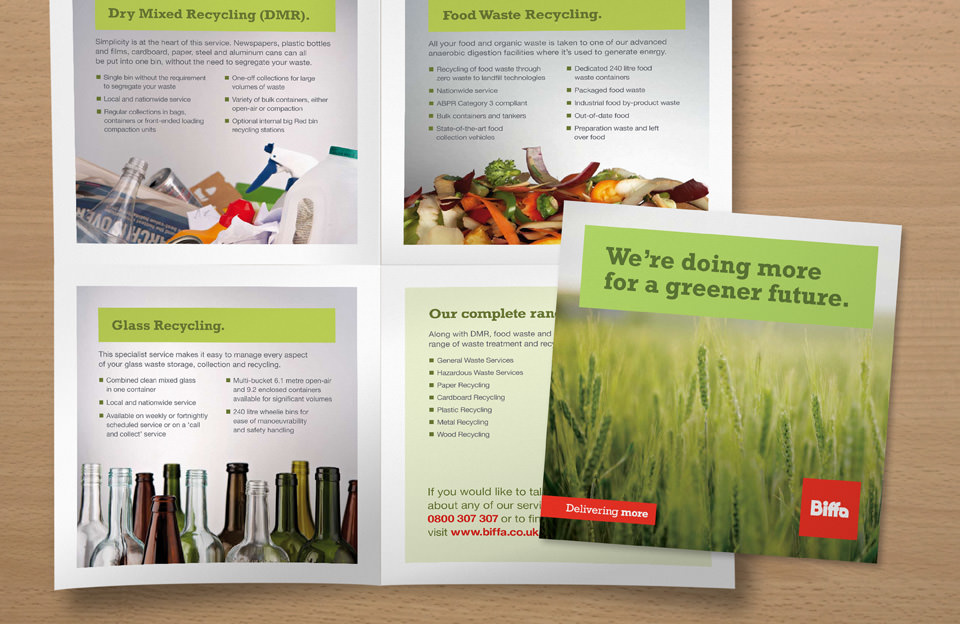
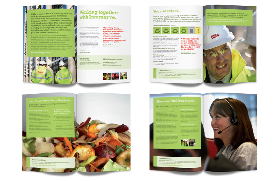
Our task was to create new positioning components and materials along with a full identity guidelines programme to ensure consistency of message across the organisation. We extracted every ounce of our knowledge and understanding of the business to deliver a solution that truly encapsulates Biffa’s proposition and vision.
Biffa’s brand identity was dominated by the colour red, but going forward we could see this as a major threat in their ability to build a brand around the message of recycling. It was an interesting challenge which questioned the very essence of the existing brand identity, and the introduction of green into the visual branding system has been fully embraced by the stakeholders within the business.
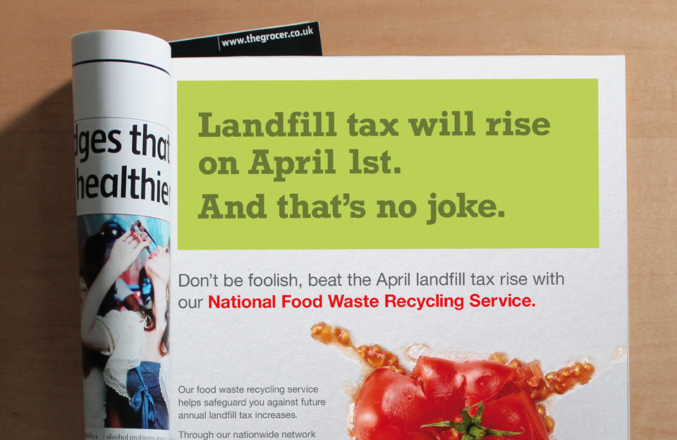
We are now rolling out the brand identity across all digital and traditional channels.
Insightful thinking and great delivery, with no waste.