All in the name of good branding.
A company has an established name that is directly related to the sector it services. It wants to keep that name, but at the same time reposition itself and widen its offering.
Time to put pen to paper.
Read more...
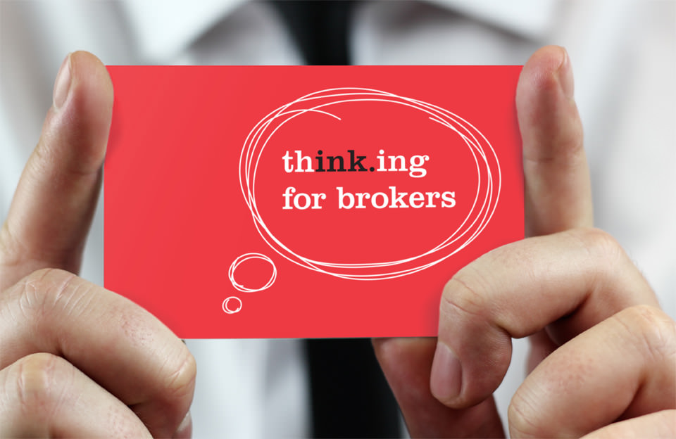
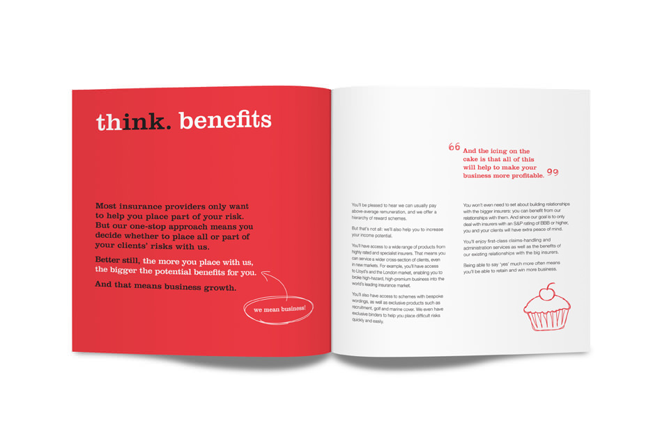
Ink Insurance, as the name suggests, built its business specialising in services for the printing industry – providing a one-stop-shop underwriting and placement solution for insurance brokers. It wanted to widen its target audience, but also preserve the brand equity in the name ‘Ink’.
At the heart of our creative response was a complete redesign of the Ink corporate identity and visual style. Hand-drawn elements change the context of the name – creating an association with ‘writing’ and not printing, and reflecting the bespoke nature of the product offering. This message is expanded upon by the ‘thinking for brokers’ and ‘think benefits’ word marks.
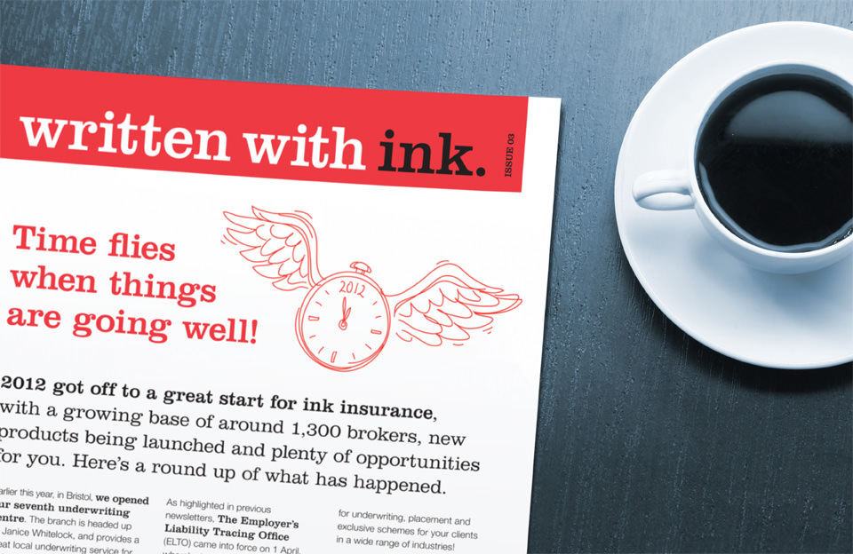
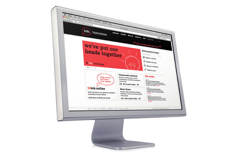
On and offline roll-out continues, and we won a prestigious Transform Award … ‘Best corporate rebrand for a spinoff/new company.’
Bringing ideas to life. In black and white.